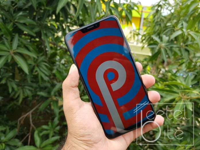
The first variant of Android was released almost 10 years ago in 2008 with the HTC G1 Dream. Back then it was wobbly and full of bugs and lacked features, however, now the Android OS is just as competitive or even better than the iOS.
But what’s new and what's improved? In the move from Android 8 Oreo to Android 9 Pie, Google has introduced loads of small interface tweaks including a new way to navigate the interface.
Let's take a look at the changes that the Android Pie has bought upon us.
Aesthetics
Android is more functional and customizable now when it rose up to popularity a few years back. However, Google decides to keep its Pixel smartphones a little more conservative.
Android Pie brings back a little colour and some curves to the system. This makes the complete UI look softened. Like the Settings menu now has colourful icons. And the drop-down Quick Settings bar uses blue circles rather than plain icons in the Android Oreo.
Wellness
Nobody likes to be tutored around, However, stuff like the display-use is one thing you should always listen to. A new feature called Dashboard tracks your apps daily usage patterns and then present it in an easily readable pie graph of the apps you use.
It also tracks how many times you unlock your phone each day including how many notifications you receive and more.
Usage Limits
Want to track how much time you use on Instagram looking at cute photos of puppies or how much time you spend on youtube watching videos? The Android Pie tracks all that and it's timer resets at the end of the day. What's more is that you can set usage limit for the apps. Once that's done the app icon greys out and you can't access it anymore.
This can help you limit the time you spend on youtube or the time you spent playing your favourite mobile game.
Volume control

Press the volume buttons on an Android Oreo phone gives a popup that depends on the context of the application you are using. That all changes in Android Pie. Volume buttons will control media volume as standard.
The volume interface also hosts a button to switch between silent, normal and vibrate-only notification modes.
Night mode
Android Oreo has a great feature called Night Light, which takes the blue light out of the display as you get closer to bedtime. This makes it easier for your eyes at night, also helping those who have inconvenience in sleeping.
Wind Down in Android Pie takes this thing to another level. When you approach the night time, the display goes grayscale and the Do Not Disturb Mode is automatically activated.
Brightness control
Android Oreo has a fairly standard adaptive brightness control mode. Android Pie update makes Adaptive Brightness control a little more intelligent. It tracks what brightness control you used in what lighting and using that data it adapts the brightness control according to that.
Battery management
Android Pie makes the control of background battery consumption use more visible, with a mode called Adaptive Battery. This controls how much battery and App can consume before getting killed based on usage patterns of the user.
Copy and Paste
Copy and pasting get a big overall, a much-needed update in Android Pie. Long-pressing and dragging to select a phrase in an article or email brings a magnified version of what’s under your finger. This makes selecting the exact portion easier. This might seem like its taken straight from the iOS because it is.
Navigation
All the Android smartphones these days sport same navigation method. You have soft keys denoting the same functions, namely back, home and overview/recent apps button.
Android Pie changes this. The Android P sports an iPhone X looking home bar. Swiping up on it takes you to home. Swiping a little right opens the recent app and swiping and holding on it takes you through all your open apps.
Also, the back buttons appear whenever it is needed depending on the context.
Recent apps

In Android Oreo, the Recent Apps display is a 3D stack of cards with each card representing one app. With the new gesture-based theme of Android Pie, the new Recent Apps screen is much more consistent with the visual design of the system and seems less like the appendix at the back of a book. It’s cleaner and more useful.
It also features the same row of popular apps as the app drawer. and the rest of the open apps in the horizontally scrolling list of big cards.


